20 Mar Ice cream email goodness

Having recently upgraded my smart phone to Ice Cream Sandwich (Android v4.0), I thought I would take a second look at the default email client to see if it had improved from the previous version i was running on Gingerbread.
As you may have gathered from my previous posts I’ve always been a fan of the K-9 Mail email client for android devices above the standard one as it offered much better handling of IMAP and Activesync folders. The built-in client would show these folders but it chose a strange and almost unusable interface to scroll through their names, by arranging them in a ticker at the top of the screen with a shortened path name.
I am happy to report that things are greatly improved in Android version 4!
Now, when you open the email client there is folder icon on the main screen…
![]()
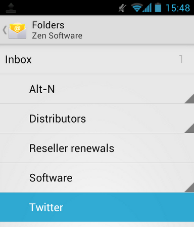
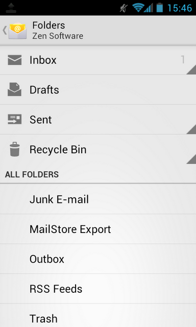
…which brings up a simple and easy to navigate folder window.
It’s easy to click through the folders to navigate down a folder tree by clicking on the triangle icon to the right of the folder name. You can then simply click on the folder name to open the folder and view its contents. At no point does the screen appear overcrowded.

The only advantage I can think of that K-9 Mail has, is the ability to add any folder to a favorite, putting it to the top of the folder list, however as the navigation is so quick I hardly miss this.
I also find the font is easier to read than the one used in K-9 Mail and messages appear to load quicker. This may just be down to the better network support in ICS but overall the user experience is much better and the closest i have yet seen to the Apple IOS email client on iPhone and iPad, which is still my personal favorite, but now not by much.


