03 Jan How to Analyse MDaemon Logs Using Microsoft Excel

A popular feature of MDaemon is its ability to let administrators quickly pinpoint message activity and session information using detailed logs. Sometimes, however, what’s required is more an overview of server usage such as how load is being shared across users or mailboxes for example.
In this post I take a look at how you can use Microsoft Excel to query data you may not even be aware is available in MDaemon!
MDaemon offers a number of statistics logs and reports that can be accessed from the web-based administration interface including things such as ‘Top email senders’ and ‘Bandwidth used’.
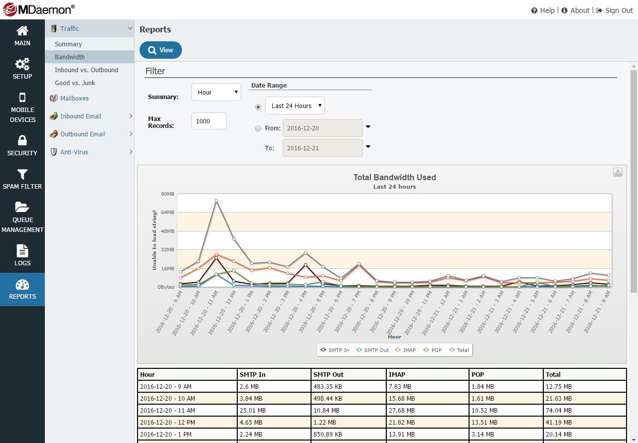
These built-in reports are very useful but recently I found myself wanting more detail on how the bandwidth for a server was being shared out between different MDaemon users, and specifically which users were using the majority of the bandwidth for IMAP traffic.
Can this be done with MDaemon?
Well actually yes, all the data is there and stored within the statistics log, we just need to turn this log on and then perform some calculations on the raw data using Microsoft Excel and pivot tables.
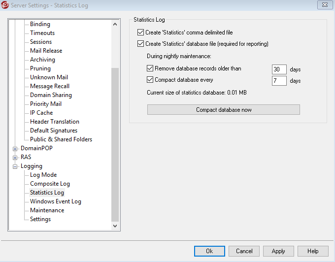
Step 1 Enabling MDaemon statistic logging to comma delimited file.
Open the MDaemon GUI and navigate to Setup > Server Settings > Logging > Statistics Log and tick the option ‘Create Statistics comma delimited file’
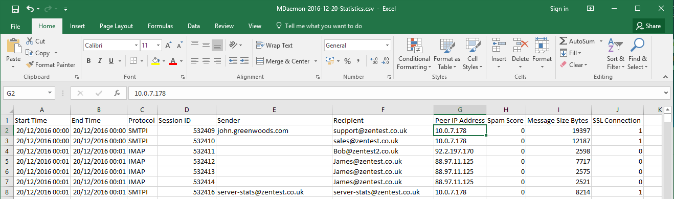
Step 2 After the relevant data has been gathered (I was looking for a whole 24 hours of data to analyze), take a copy of the statistics log file for the relevant day and place it in a new folder.
The logs can be found in C:\MDaemon\Logs\ folder in the format MDaemon—-Statistics.log
Step 3 Change the extension of the new file to .csv to associate with Excel and double-click to open.
Step 4 The first task is to add a row at the very top and create labels for each column.
The label names will be as follows:
Start Time
End Time
Protocol
Session ID
Sender
Recipient
N/A
N/A
Peer IP Address
N/A
N/A
Spam Score
Message Size bytes
SSL Connection

Step 5 We don’t need any of the ‘N/A’ columns so these can be deleted leaving the following…
Step 6 Add a new sheet tab and select ‘insert pivot table’
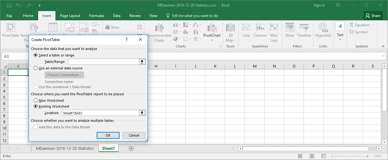
Step 7 Switch back to the first sheet (the one that contains your data ) and select all the data from the first cell (top left) to the last cell (bottom right). Make sure you include the first row with the column names.
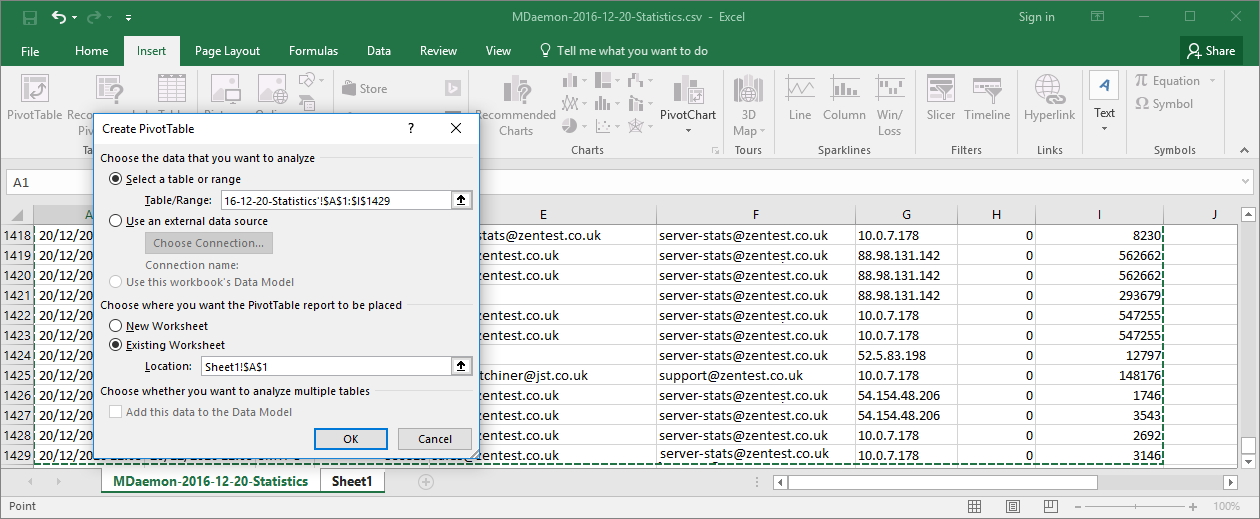
Click OK to create the Pivot table
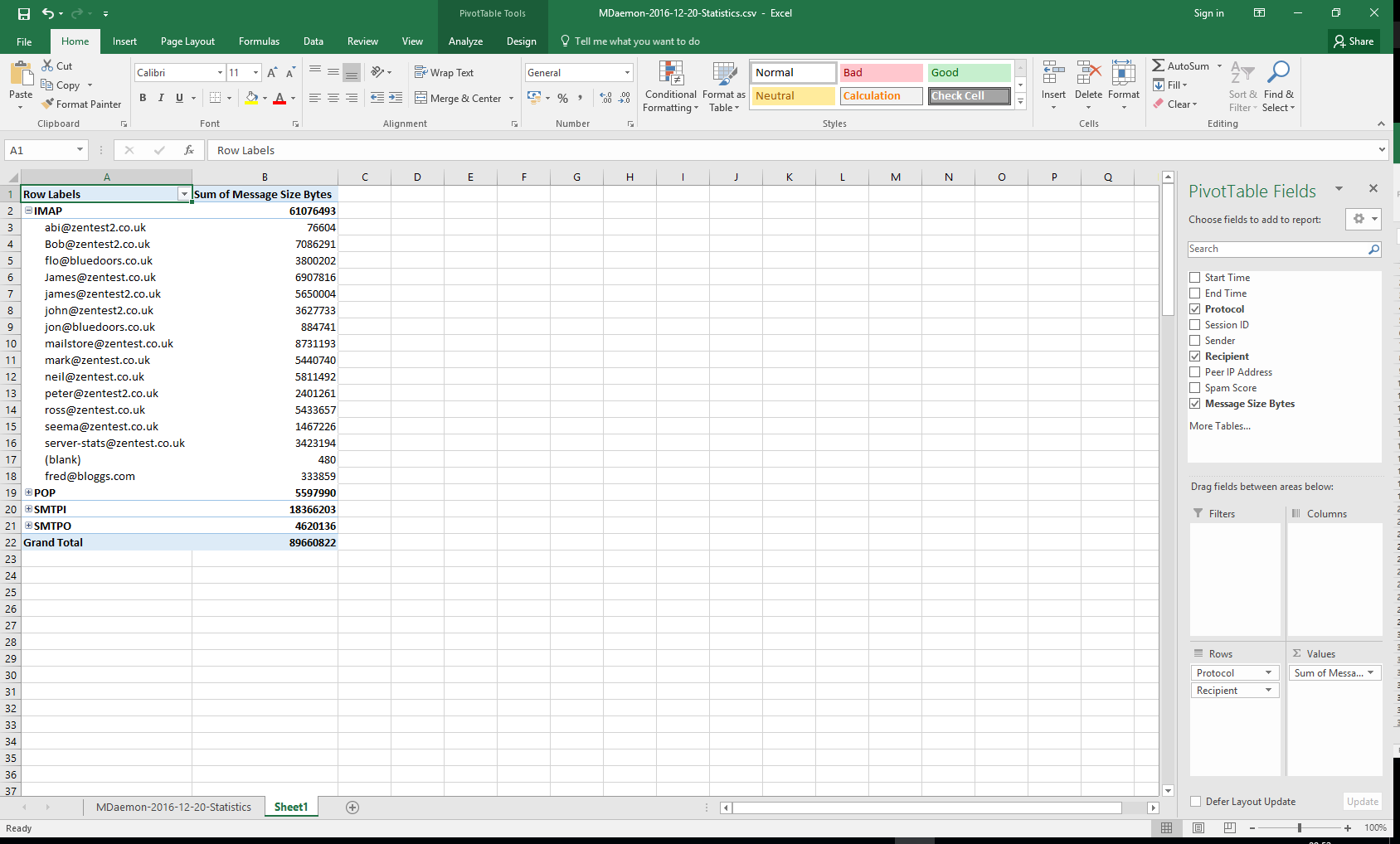
Step 8 Select the pivot table fields in the following order..
Protocol
Recipient
Message Size Bytes
You should see your pivot table gets populated with a list of the protocols broken down by users showing a total of how many bytes each user has used that day.
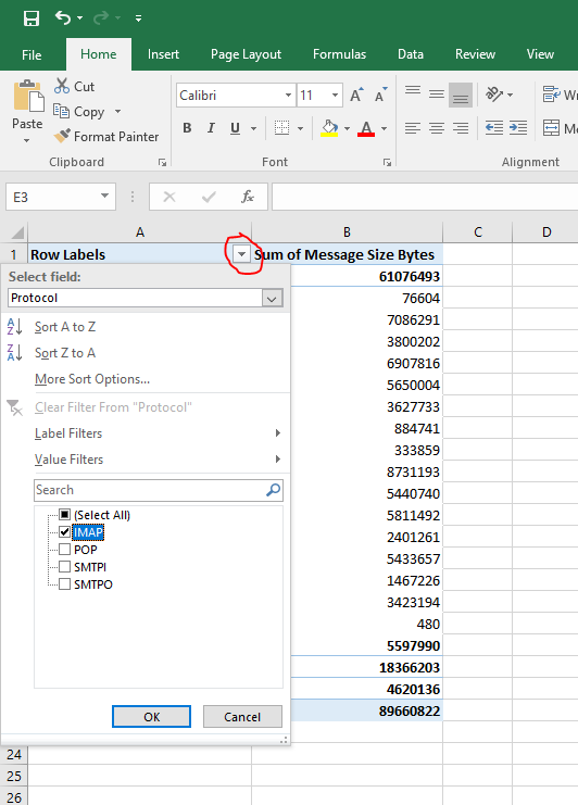
Step 9 Let’s just focus on the IMAP data by filtering the row labels, click on the small down arrow and select just the IMAP data to be shown.
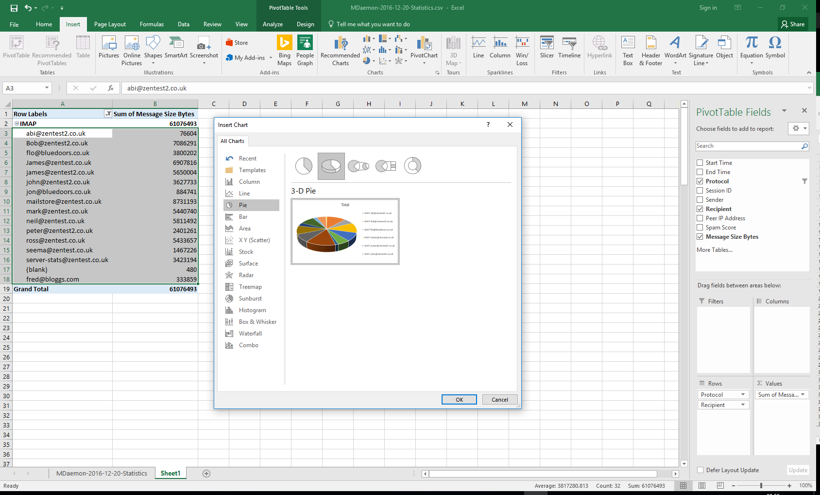
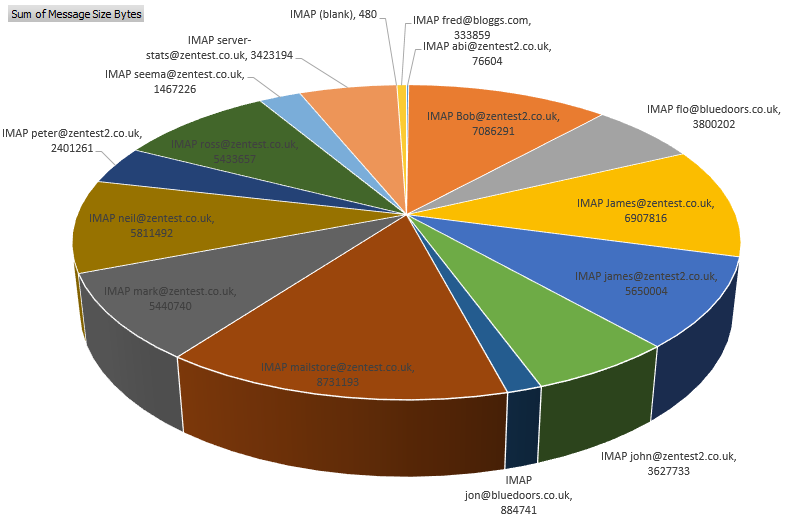
Step 10 Want to see this information as a Pie Chart? No problem simply select the table of data to show as a graph, in this example, I will select the IMAP table and contents, then insert a pivot chart.
Step 11 You can format the graph by selecting the ‘Plus’ icon and edit the ‘Chart Elements’ as needed.
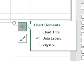
Here I have added more data elements and removed the chart title and legend leaving a basic graph showing how the IMAP traffic has been broken down per user.
This is just one example of how you can drill down into the data stored within the statistics log. There are many other ways to filter and order the pivot data fields and view the MDaemon statistics data in different ways.
I hope you found that useful!